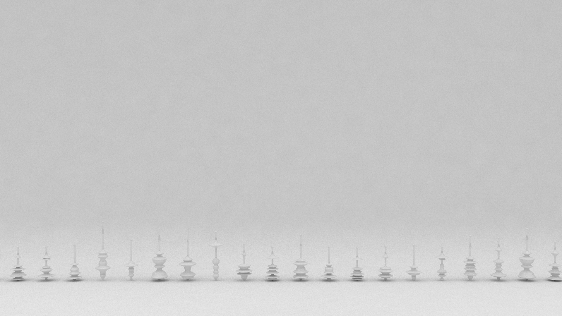
balance
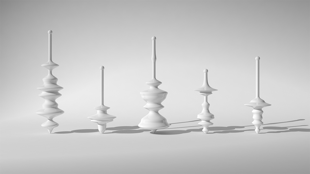
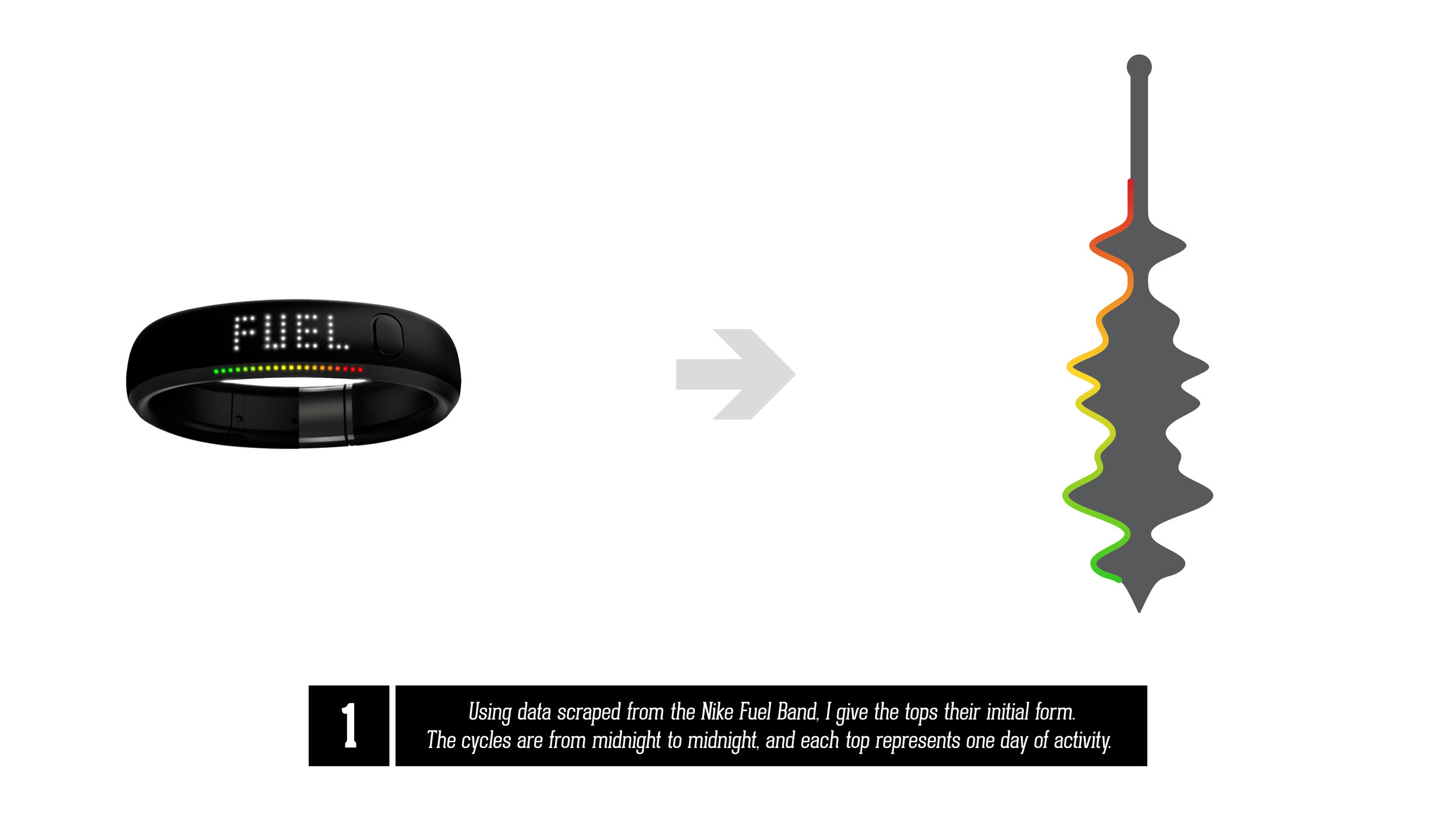
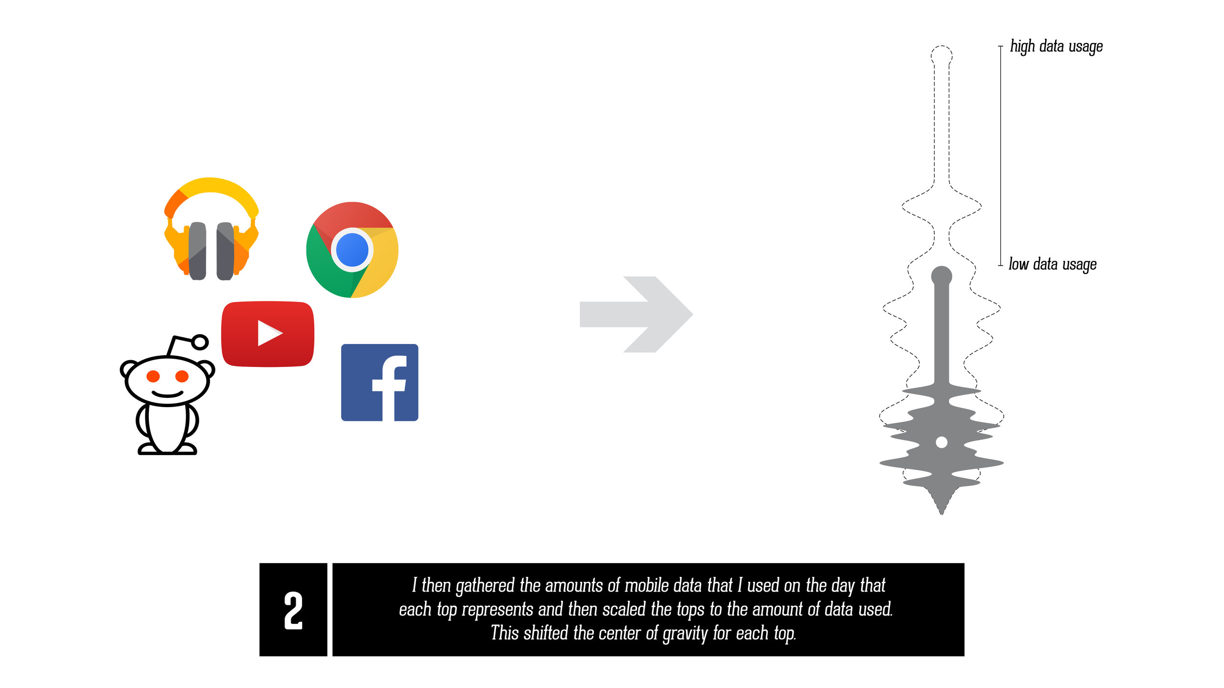
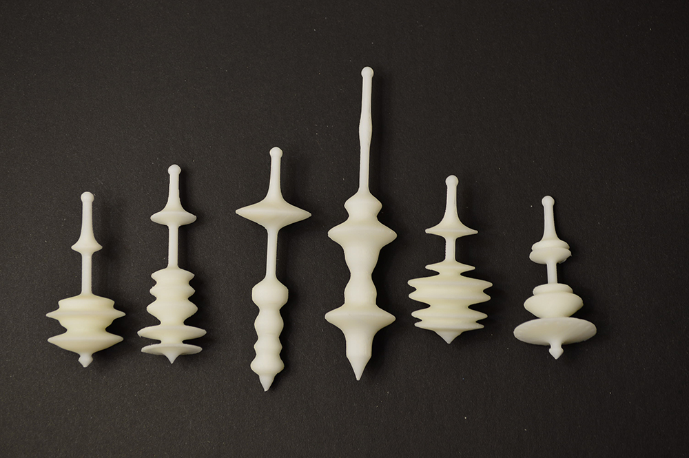
Balance is a tangible data visualization of my monthly activity. It transforms data collected from a Nike Fuel Band and my internet usage data from my smartphone into 3D printed spinning tops. The tops either spin or fall, based on the relation of how active I was, to how lazy I was and used the internet on a given day. I collected the data from the fuel band and manually recorded my data usage at the end of each day. I then wrote a script in Grasshopper to generate the top geometry. The fuel band data creates the contours for the top, and my online activity graphs scales the top to shift the center of gravity, allowing or not allowing some tops to spin.
HOW IT WORKS
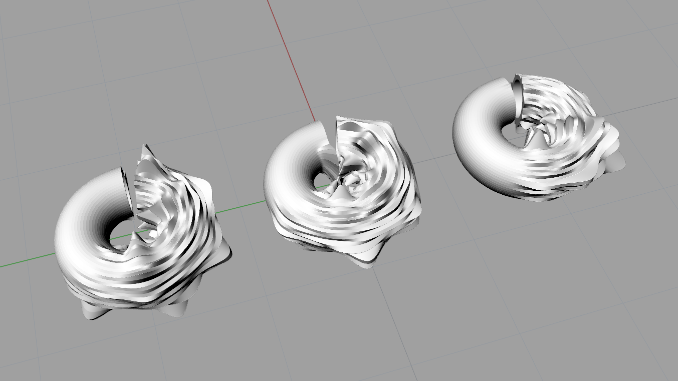
In my first attempt at the visualization, I took the fuel band data and mapped it to the surface of a torus, which subsequently deformed the torus. Then I scaled the torus based on my online data usage. The visualization did not end up working well and was really hard to read. The next iteration I mapped my fuel band data by physically deforming the surface of the display area of the fuel band. The intent was to attempt to draw a connection between the visualization and the fuel band itself. However, the visualization came out a bit muddied.
In the final iteration I made it my goal, to allow my data to physically affect an object. So to represent the balance between the two sets of data, I opted to create spinning tops. The fuel band data creates the contours for the top, and my online activity graphs scales the top to shift the center of gravity, allowing or not allowing some tops to spin